Fareed Barakaفريد بركة
economy of art
Economy Of Art
Data science practicum, TU Berlin — extended research
Developed during a Data Science Practicum at TU Berlin in collaboration with a group, this project explores how characteristics of artworks and artists influence auction prices. Using a dataset of over 37,000 paintings and 45,296 auction lots valued at $9.47 billion, it studies what actually predicts what a painting sells for — and, just as importantly, what doesn't.
Twelve findings below: what predicts price · the superstar economy · canvas size · medium · portraiture · a world map of dominant color by nationality · the price distribution · market activity over time · the death-year premium · canvas orientation · a full feature correlation study · value vs. volume by nationality.
View on GitHub Connect on LinkedInWhat Predicts a Painting's Price?
Feature correlation study
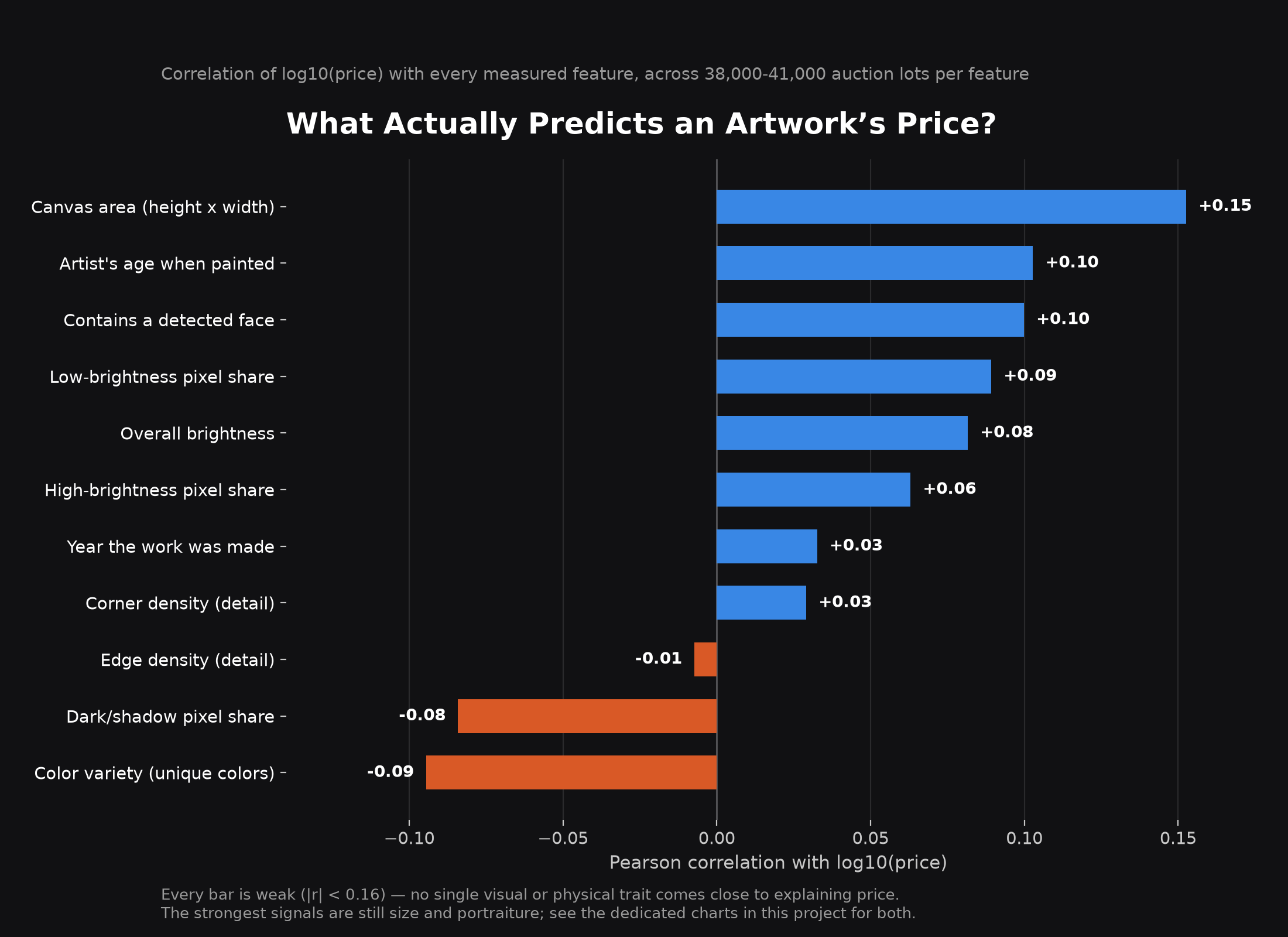
Every measured trait — canvas size, brightness, color variety, geometric detail, even the artist's age when a work was made — was correlated against price across roughly 40,000 auction lots. None of them explain value on their own; the strongest, canvas size, is still a weak correlation (r = 0.15).
The Economy Of Art Is a Superstar Economy
Market inequality
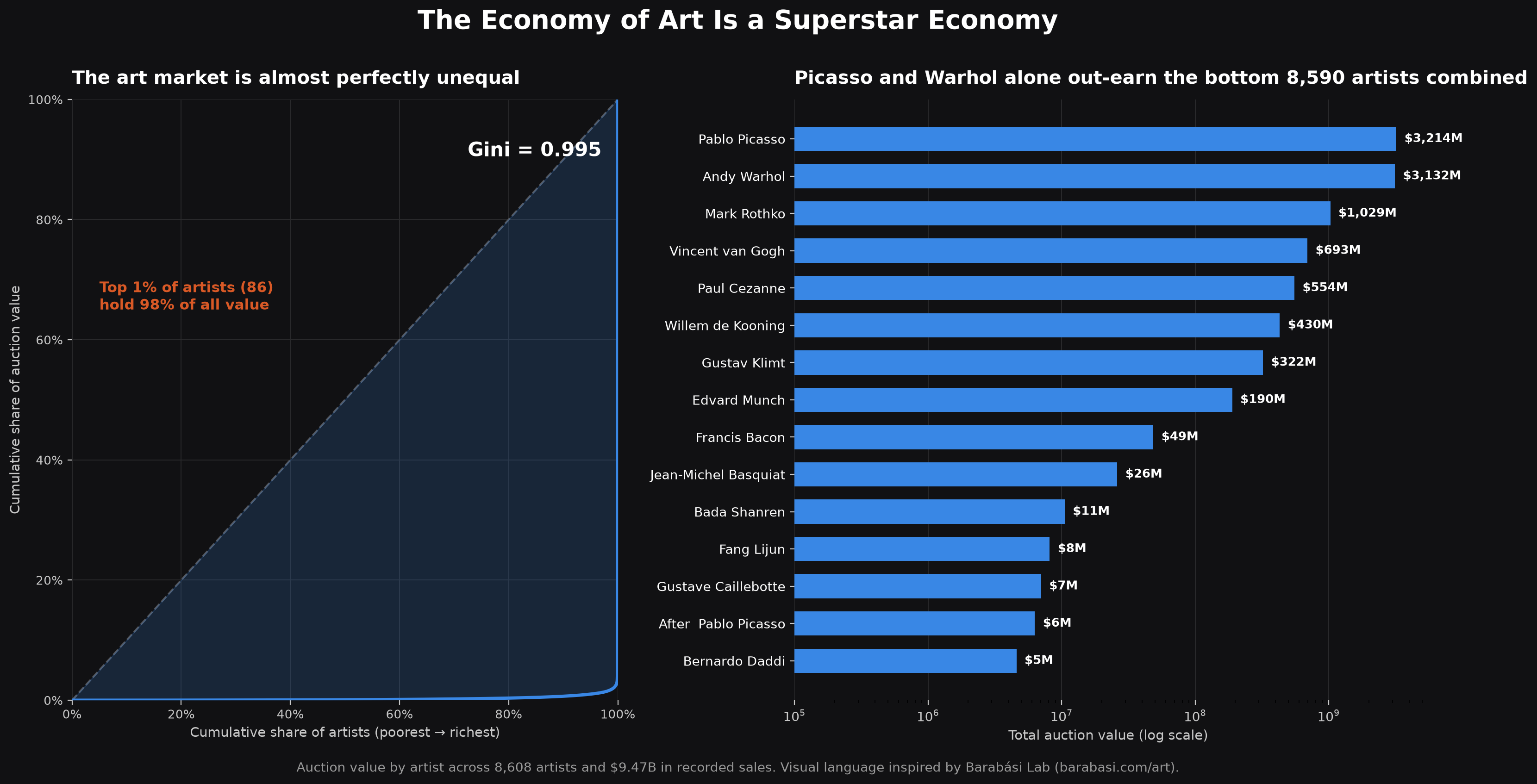
A Lorenz curve of the $9.47 billion in recorded sales gives a Gini coefficient of 0.995 — the top 1% of artists hold 98% of all value, and Pablo Picasso and Andy Warhol alone out-earn the other 8,590 artists in the dataset combined.
Bigger Canvases Sell for More — a Little
Hedonic pricing
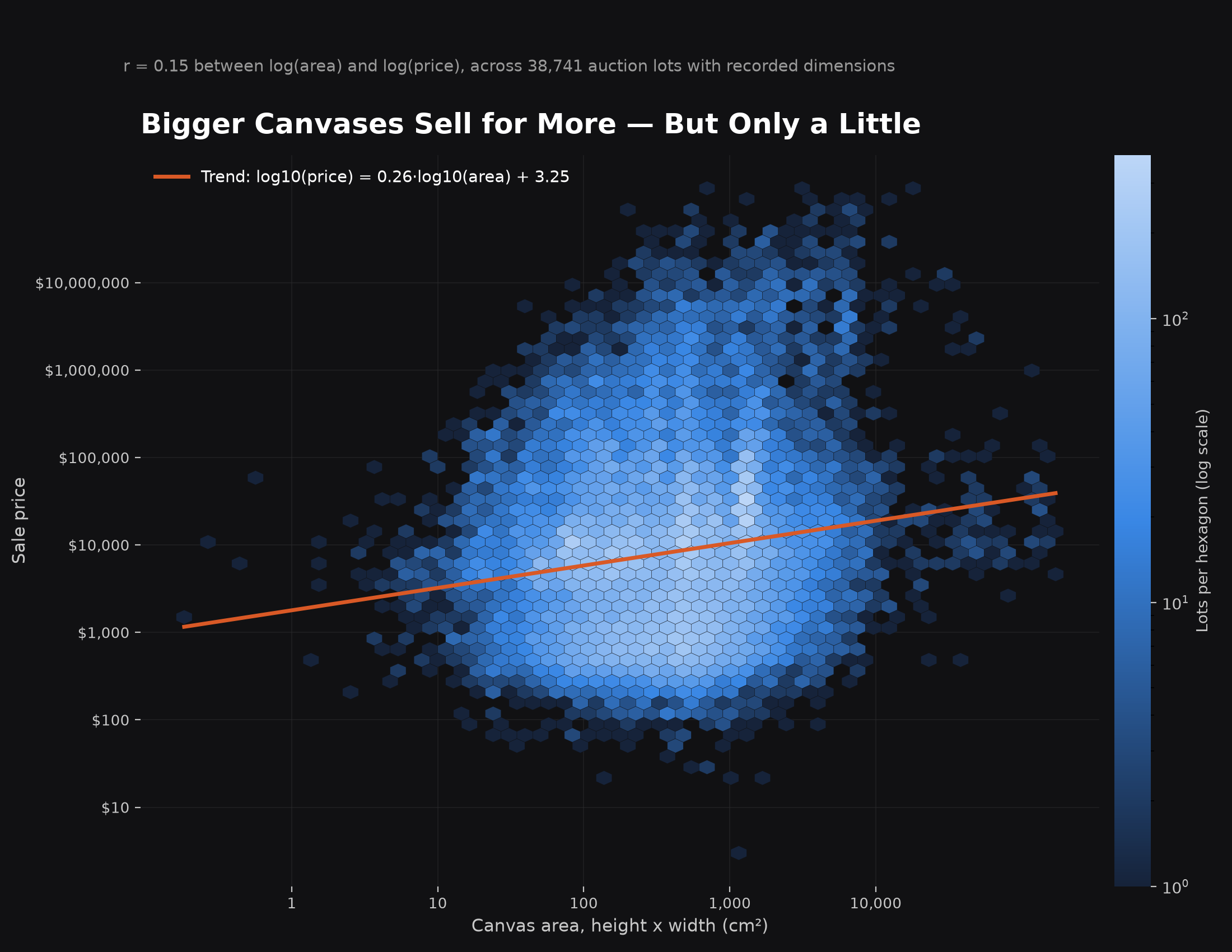
A density plot of roughly 38,700 lots with recorded dimensions shows a real but modest relationship between canvas area and price (r = 0.15), rendered as a hexbin since a plain scatter plot is unreadable at this volume.
Oil Paintings Dominate the Market, Prints Sell Better Per Piece
Materials & medium
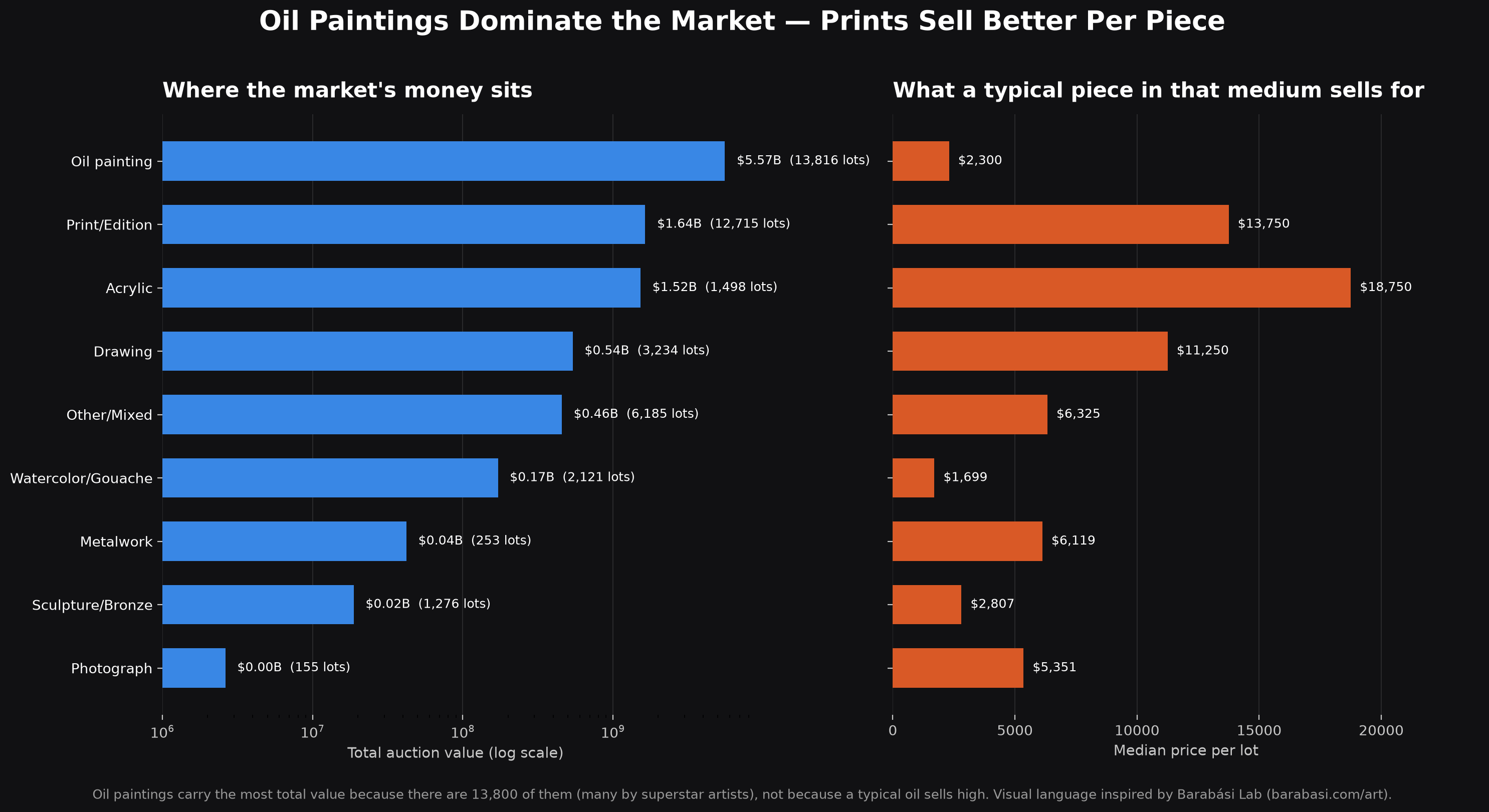
Oil paintings hold the most total auction value simply because there are over 13,800 of them; a typical oil painting actually has a lower median price than a typical print or acrylic work.
Faces Sell: The Portrait Premium
Computer vision
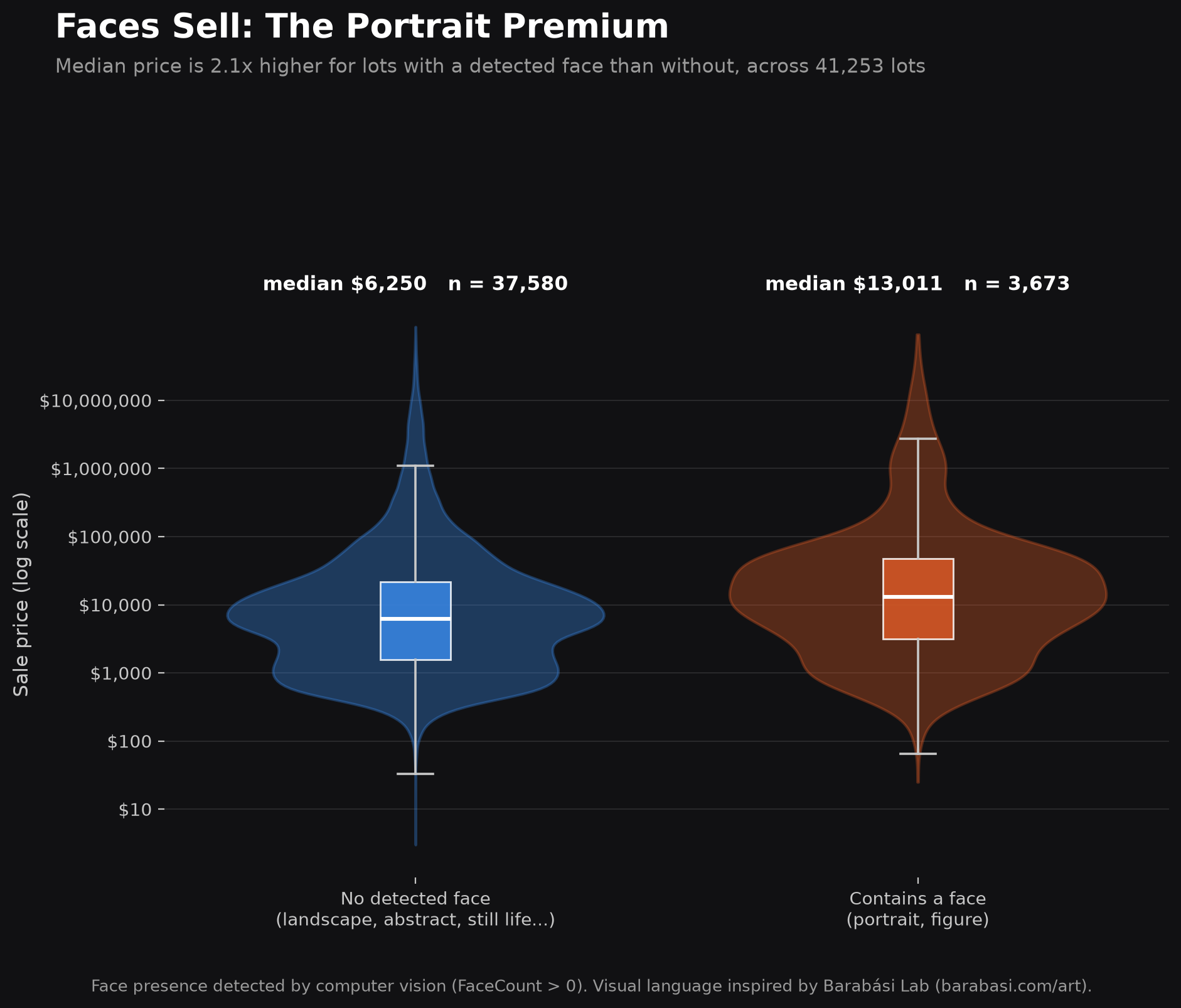
Every image in the dataset was run through face detection. Lots with a detected face have a median price 2.1x higher than those without — the strongest visual signal found in the entire study.
The World, Painted in Its Own Colors
World map
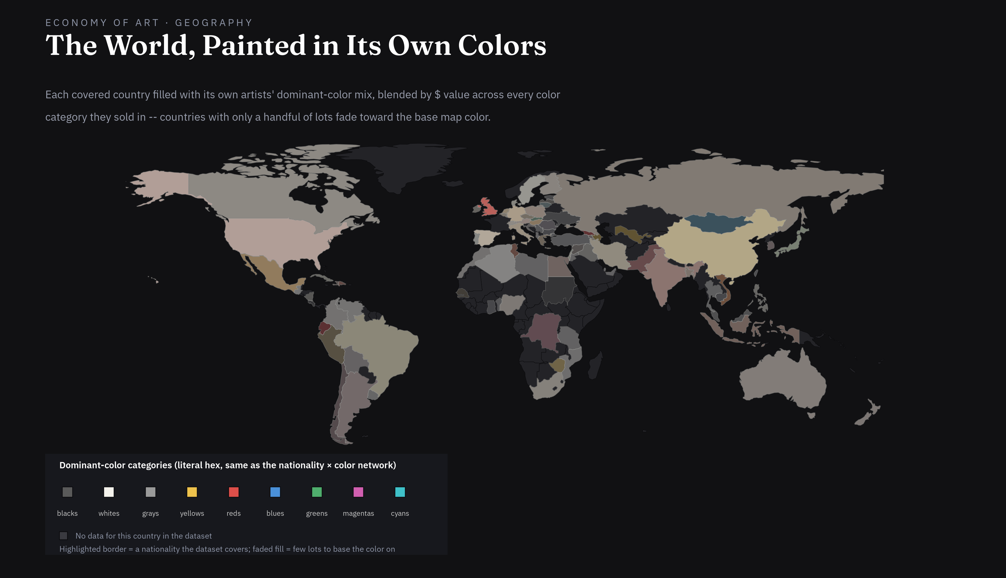
96 countries filled with their own artists' dominant-color mix — not symbolic, literal: a blend of the actual hex values behind each dominant-color category, blended by $ value across every category they sold in. A second, independent weighting fades countries with only a handful of recorded lots toward the base map color, so a single high-value sale can't paint a country as confidently as hundreds of ordinary ones would.
The Art Market Runs on a Log-Normal Curve
Price distribution
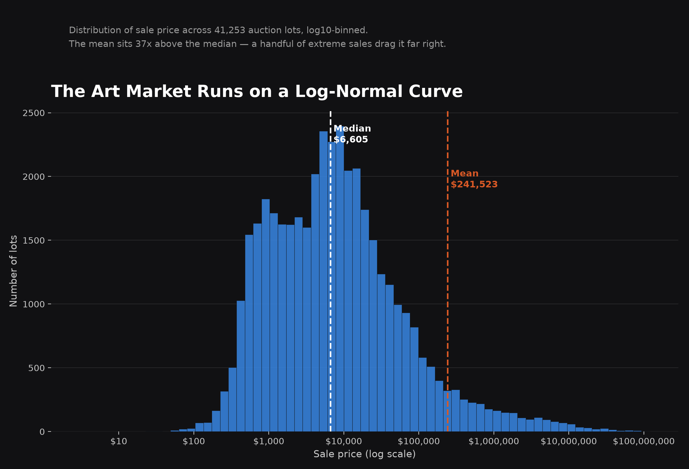
The foundational shape behind every other finding here: sale price across 41,253 lots. The mean sits 37x above the median — a handful of extreme sales drag it far to the right.
Auction Volume and Value Over Time
Two decades of data
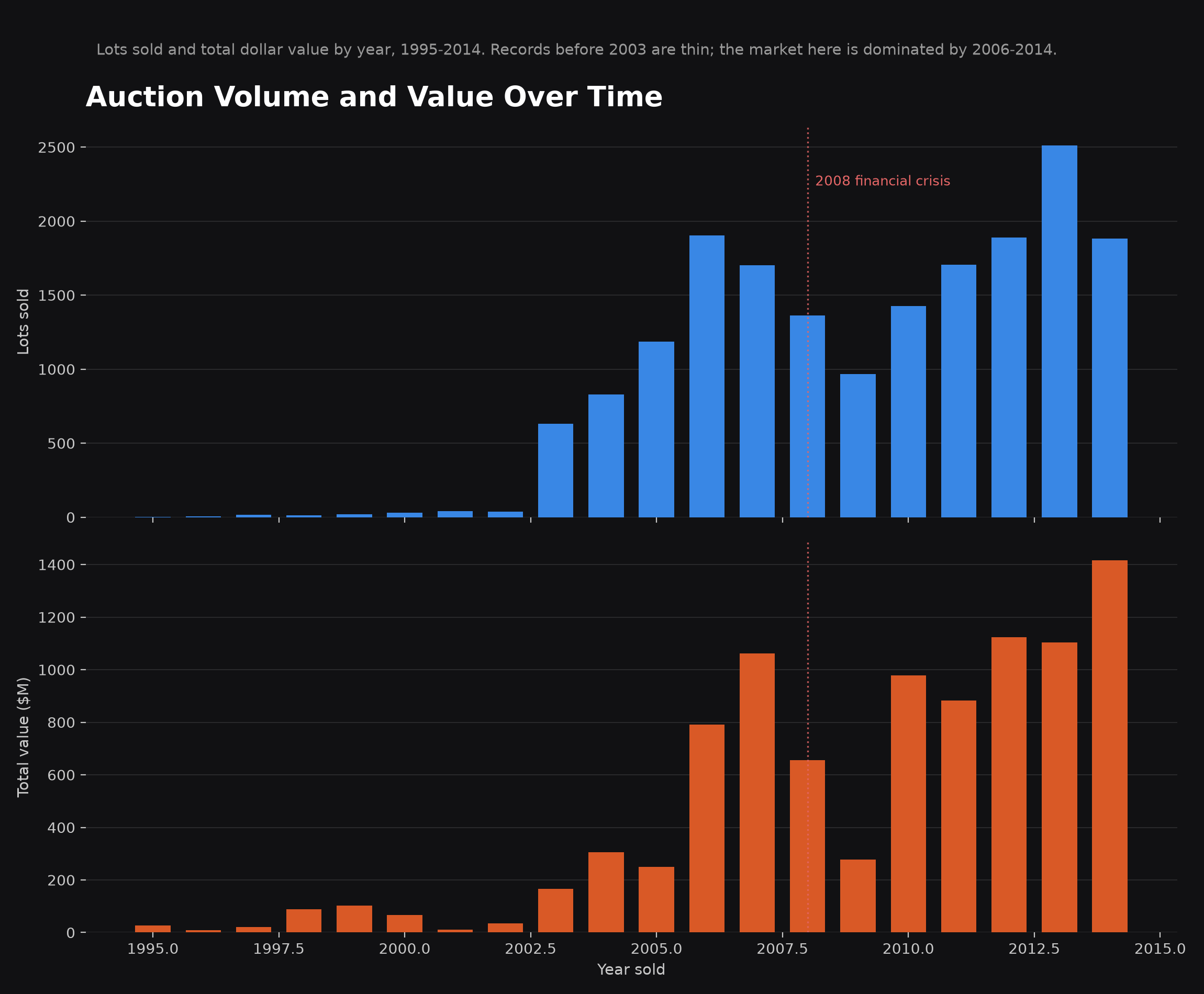
Lots sold and total value by year, 1995–2014. Both climb steadily, dip visibly around the 2008 financial crisis, and recover by 2010.
A Recorded Death Year Comes With a Price Premium
Market composition
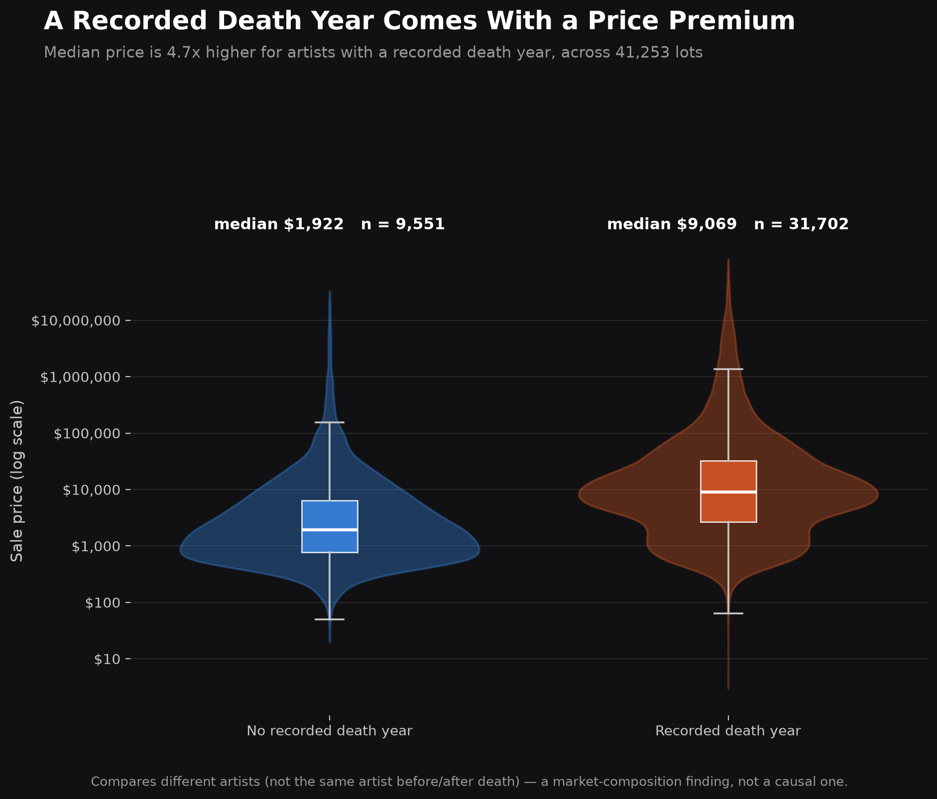
Median price is 4.7x higher for artists with a recorded death year than for those without — a market-composition signal, since the data can't isolate the same artist's prices before and after death.
The Shape of the Canvas Matters
Format & orientation
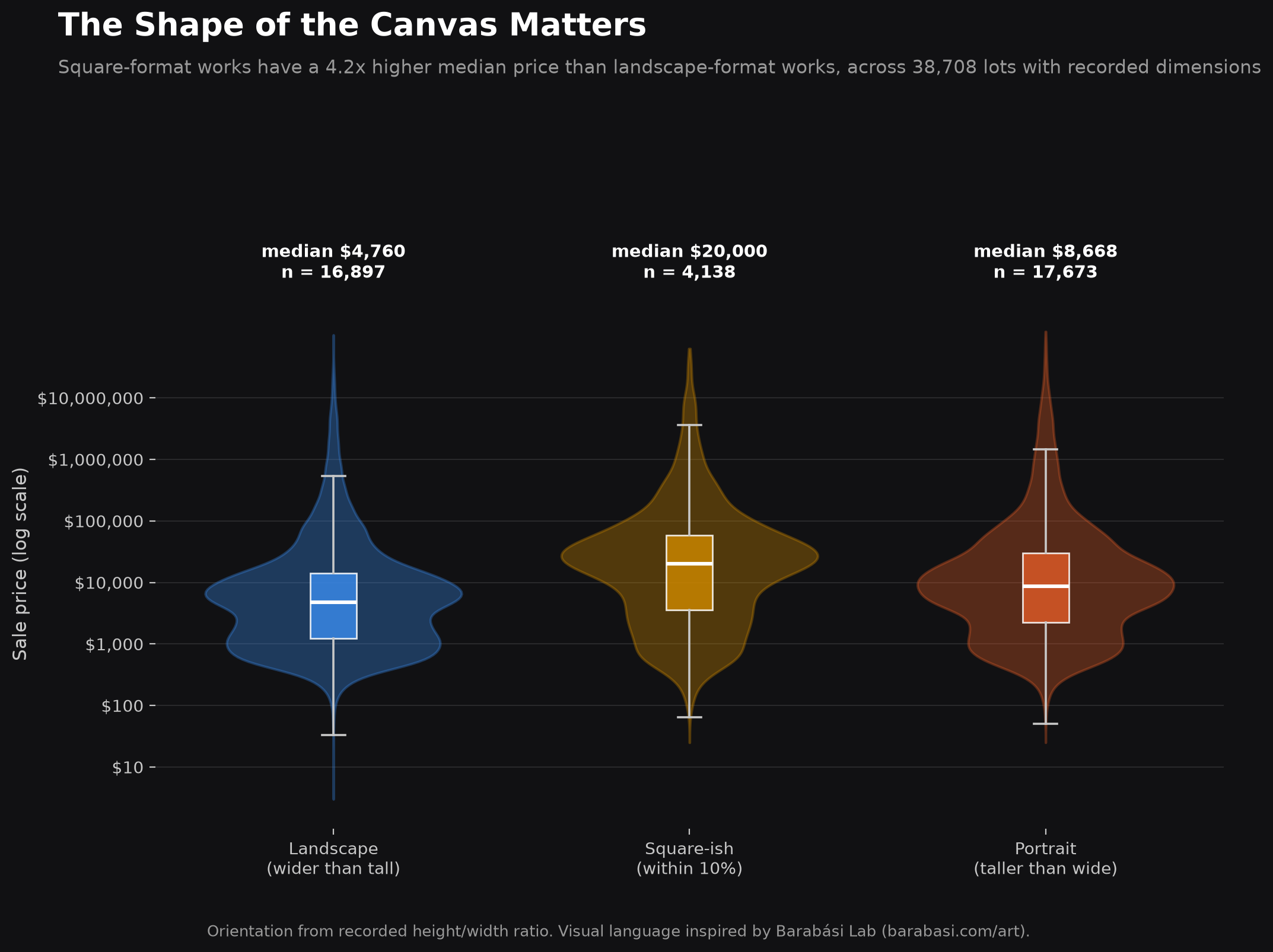
Square-format works have a 4.2x higher median price than landscape-format works, independent of overall size.
How Every Measured Feature Relates to Every Other
Full feature study
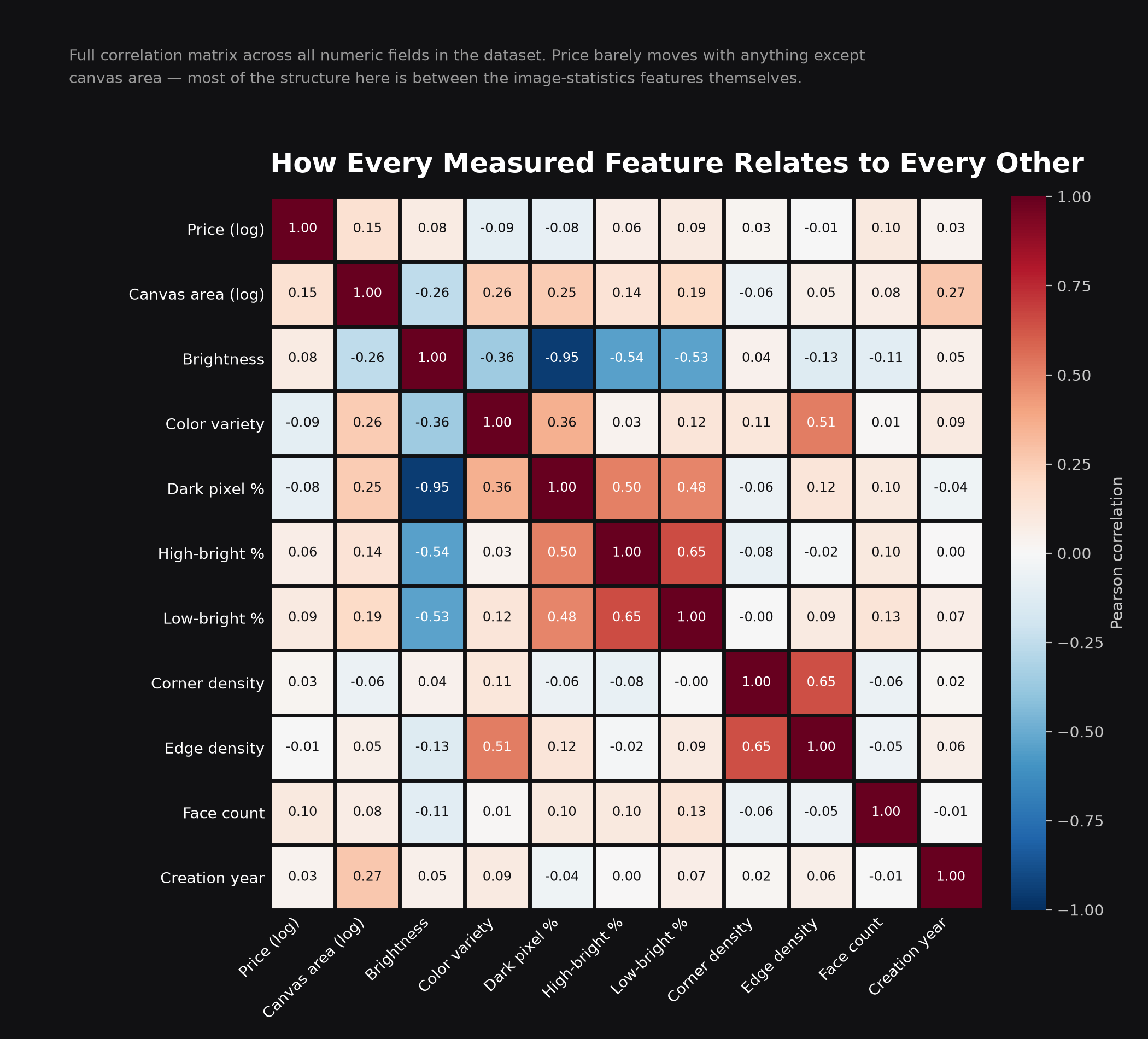
The complete correlation matrix across all numeric fields in the dataset. Price barely moves with anything; most of the real structure sits between the image-statistics features themselves.
The Most Valuable Markets Are Not the Most Active Ones
Geography of value
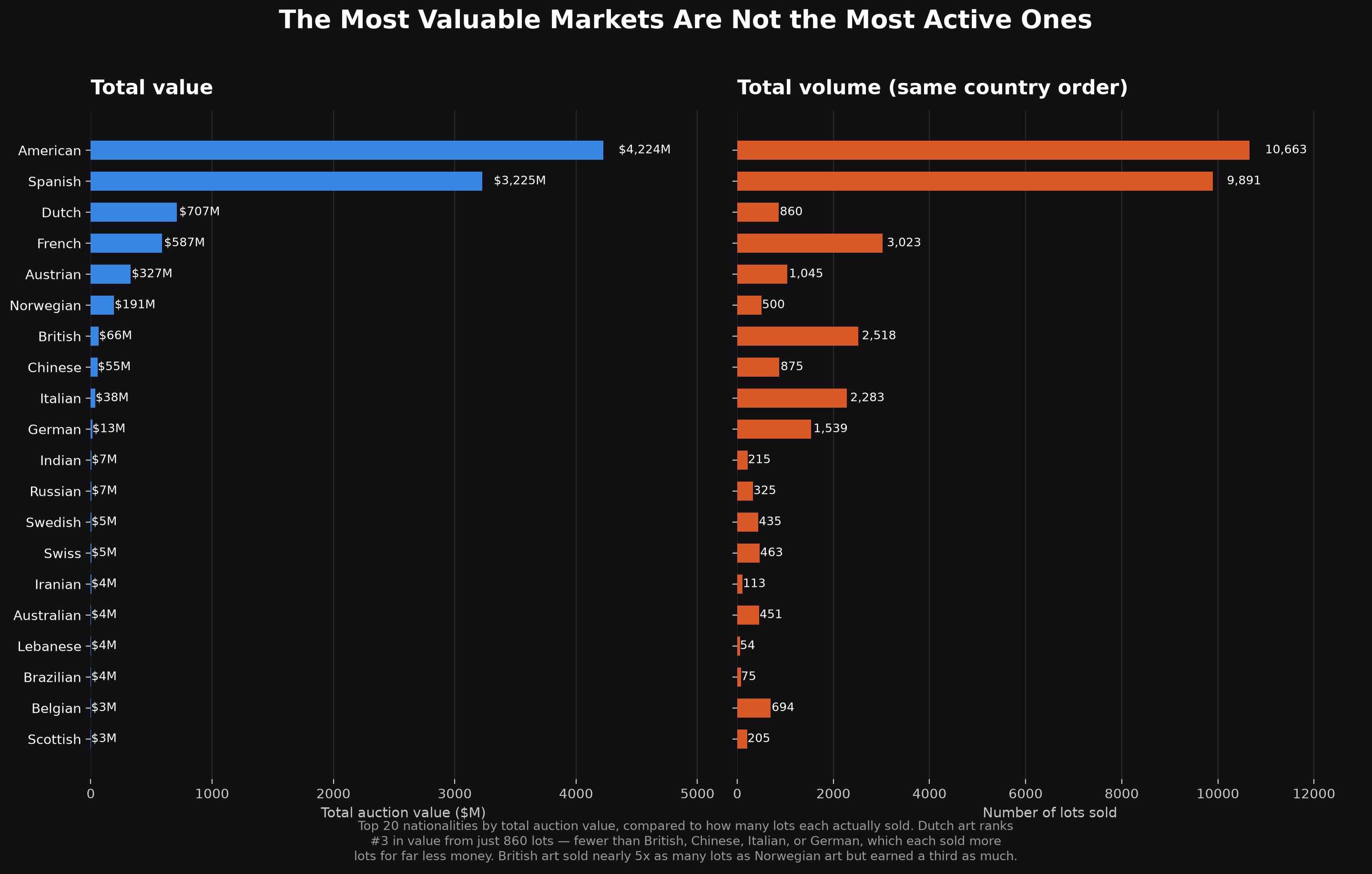
Comparing total auction value to lot volume by nationality: Dutch art ranks #3 in value from just 860 lots — fewer than several countries that sold far more for far less.
Explore the Full Project
Code & data
Every chart above has a matching Python script and is documented in full on GitHub, alongside the original auction dataset (37,000+ paintings, $9.47B valued).
View on GitHub Connect on LinkedIn